Ggplot Project 1

Utilizing packages like lubridate and tidyverse to manipulate the data as well as ggplot to visualize, I have worked in teams to create the following codes.
Where Do People Drink The Most Beer, Wine And Spirits?
Back in 2014,
fivethiryeight.com
published an article on alchohol consumption in different countries. The
data drinks is available as part of the fivethirtyeight package.
library(fivethirtyeight)
data(drinks)
Exploring the data with the skim command
drinks %>% skim #Skim the data for variable types and missing values.| Name | Piped data |
| Number of rows | 193 |
| Number of columns | 5 |
| _______________________ | |
| Column type frequency: | |
| character | 1 |
| numeric | 4 |
| ________________________ | |
| Group variables | None |
Variable type: character
| skim_variable | n_missing | complete_rate | min | max | empty | n_unique | whitespace |
|---|---|---|---|---|---|---|---|
| country | 0 | 1 | 3 | 28 | 0 | 193 | 0 |
Variable type: numeric
| skim_variable | n_missing | complete_rate | mean | sd | p0 | p25 | p50 | p75 | p100 | hist |
|---|---|---|---|---|---|---|---|---|---|---|
| beer_servings | 0 | 1 | 106.16 | 101.14 | 0 | 20.0 | 76.0 | 188.0 | 376.0 | ▇▃▂▂▁ |
| spirit_servings | 0 | 1 | 80.99 | 88.28 | 0 | 4.0 | 56.0 | 128.0 | 438.0 | ▇▃▂▁▁ |
| wine_servings | 0 | 1 | 49.45 | 79.70 | 0 | 1.0 | 8.0 | 59.0 | 370.0 | ▇▁▁▁▁ |
| total_litres_of_pure_alcohol | 0 | 1 | 4.72 | 3.77 | 0 | 1.3 | 4.2 | 7.2 | 14.4 | ▇▃▅▃▁ |
Finding the top 25 beer consuming countries
#Create a plot to show the top 25 beer consuming countries
plot1<-drinks %>%
  slice_max(order_by=beer_servings, n=25) %>%  #Select the top 25 beer consuming countries data
  ggplot(aes(x=beer_servings, y=reorder(country,beer_servings))) + # Plot the data, descending order
  geom_col() +
  theme_bw() +
  labs(title='Beer Consumption by Country', subtitle= 'Top 25', x='Servings (per person)', y='Country') +
  NULL

plot1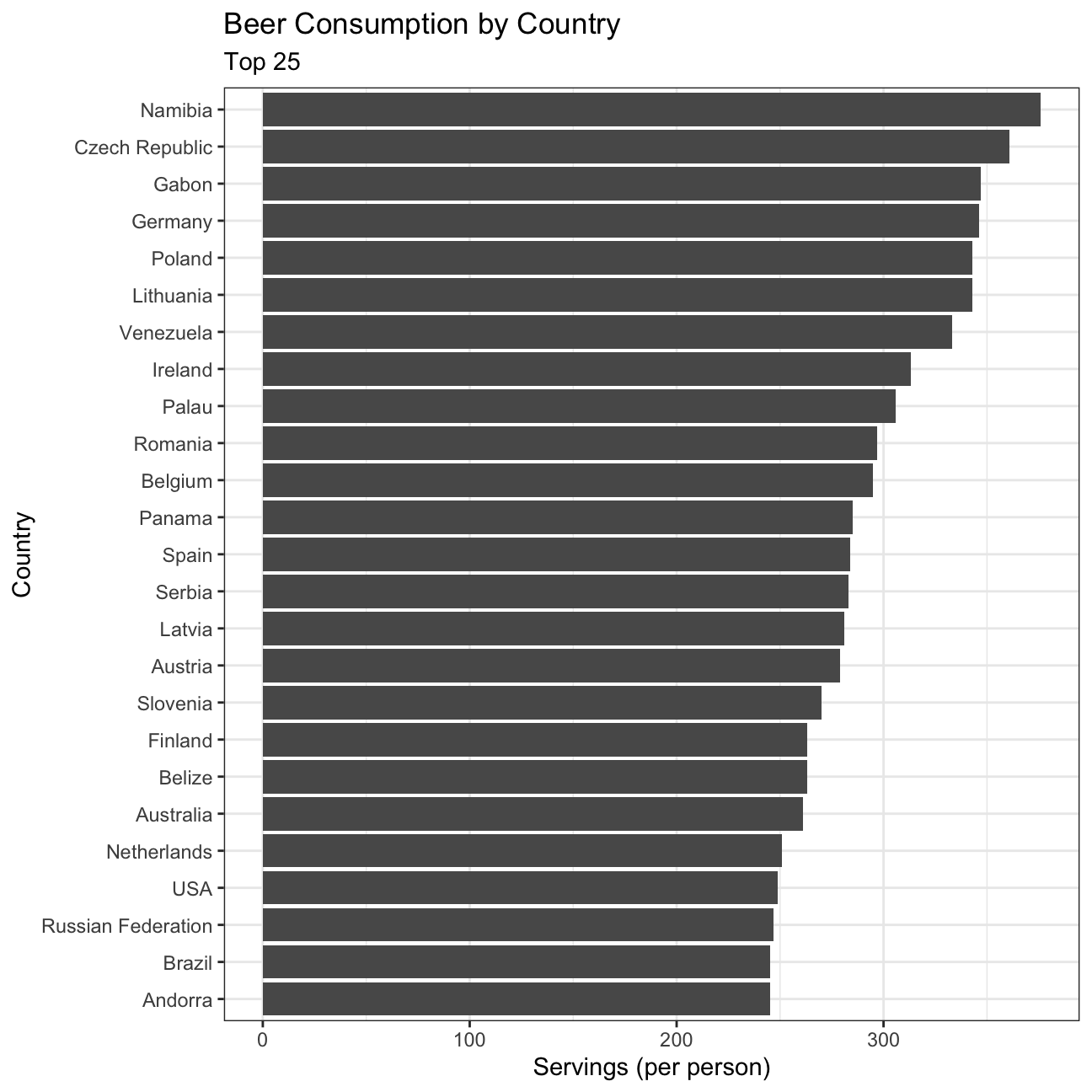
Finding the top 25 wine consuming countries
#Create a plot to show the top 25 wine consuming countries
plot2 <- drinks %>%
  slice_max(order_by=wine_servings, n=25) %>% #Select the top 25 wine consuming countries
  ggplot(aes(x=wine_servings, y=reorder(country, wine_servings)))+ # Plot the data, descending order
  geom_col() +
  theme_bw() +
  labs(title='Wine Consumption by Country',subtitle= 'Top 25', x='Servings (per person)', y='Country') +
  NULL

plot2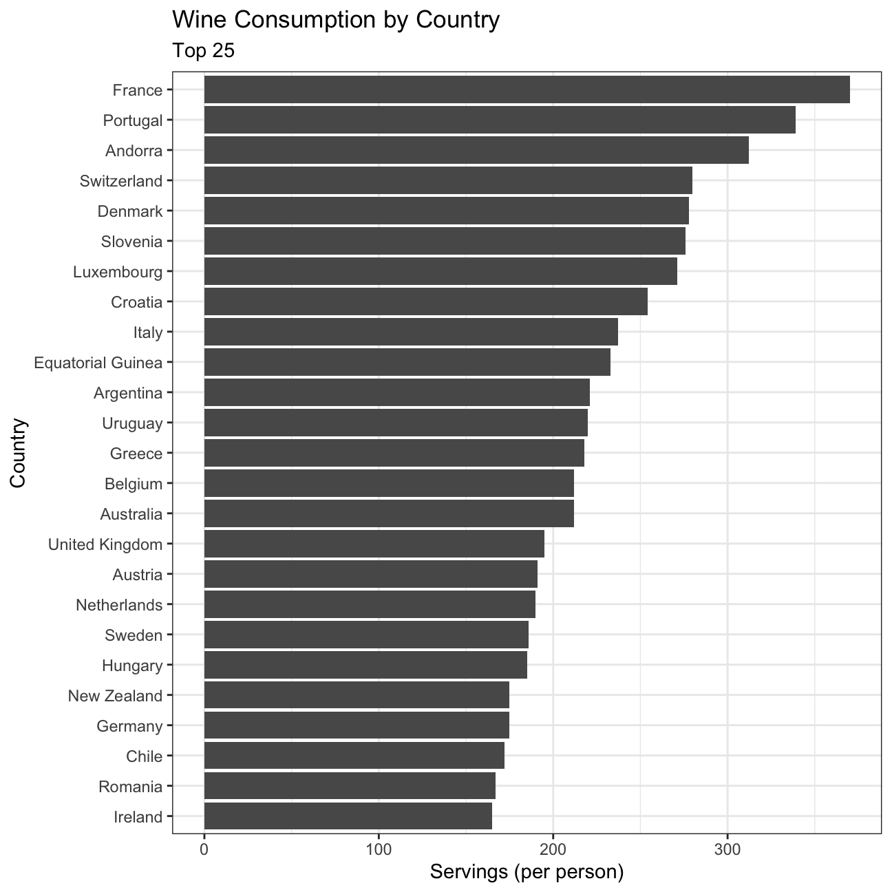
Finding the top 25 spirit consuming countries
#Create a plot to show the top 25 spirit consuming countries
plot3 <- drinks %>%
  slice_max(order_by=spirit_servings, n=25) %>% #Select the top 25 spirit consuming countries
  ggplot(aes(x=spirit_servings, y=reorder(country,spirit_servings))) + # Plot the data, descending order
  geom_col() +
  theme_bw() +
  labs(title='Spirit Consumption by Country', subtitle= 'Top 25', x='Servings (per person)', y='Country') +
  NULL

plot3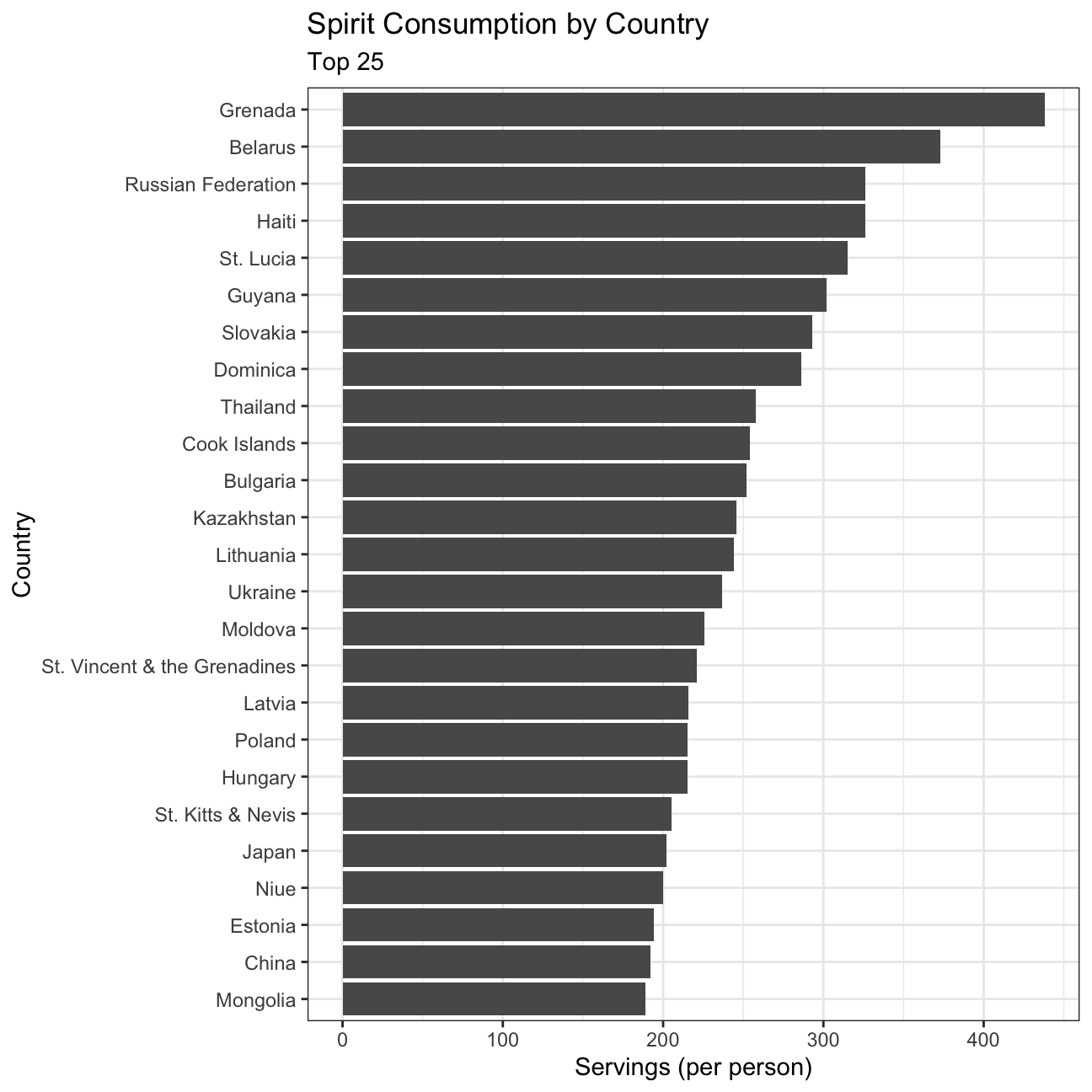
INFERENCE
Rudimental factors that affect consumption of beer, wine, and spirit include production levels, drinking age limit, pricing, and culture.
Based on the data, it can be observed that beer consumption is the highest for Namibia, Czech Republic, Gabon, and Germany. This can perhaps be attributed to the beer triangle in Namibia, low-cost beer in Czech Republic (cheaper than water), and the lowest drinking age in Germany (16 as opposed to 18 for other countries) (Kohli 2021, Nugent 2021) .
As for wine consumption, France (370 wine servings), Portugal, Andorra, and Switzerland top the list while Ireland is in position 25, at 150 servings. The distribution of the 25 countries seems to have high variance.
Lastly, similar to the wine consumption distribution, spirit consumption also appears to have high variance. While Grenada has a high consumption of spirits perhaps due to culture (women have higher per capita consumption than men) and Belarus due to the relaxed policies, Mongolia may have lower consumption as they prefer their regional fermented milk alcohol drinks (OECD 2020).
Analysis of movies- IMDB dataset
We will look at a subset sample of movies, taken from the Kaggle IMDB 5000 movie dataset
movies <- read_csv(here::here("data", "movies.csv"))
glimpse(movies)
## Rows: 2,961
## Columns: 11
## $ title <chr> "Avatar", "Titanic", "Jurassic World", "The Avenge…
## $ genre <chr> "Action", "Drama", "Action", "Action", "Action", "…
## $ director <chr> "James Cameron", "James Cameron", "Colin Trevorrow…
## $ year <dbl> 2009, 1997, 2015, 2012, 2008, 1999, 1977, 2015, 20…
## $ duration <dbl> 178, 194, 124, 173, 152, 136, 125, 141, 164, 93, 1…
## $ gross <dbl> 7.61e+08, 6.59e+08, 6.52e+08, 6.23e+08, 5.33e+08, …
## $ budget <dbl> 2.37e+08, 2.00e+08, 1.50e+08, 2.20e+08, 1.85e+08, …
## $ cast_facebook_likes <dbl> 4834, 45223, 8458, 87697, 57802, 37723, 13485, 920…
## $ votes <dbl> 886204, 793059, 418214, 995415, 1676169, 534658, 9…
## $ reviews <dbl> 3777, 2843, 1934, 2425, 5312, 3917, 1752, 1752, 35…
## $ rating <dbl> 7.9, 7.7, 7.0, 8.1, 9.0, 6.5, 8.7, 7.5, 8.5, 7.2, …Besides the obvious variables of title, genre, director, year,
and duration, the rest of the variables are as follows:
gross: The gross earnings in the US box office, not adjusted for inflationbudget: The movie’s budgetcast_facebook_likes: the number of facebook likes cast memebrs receivedvotes: the number of people who voted for (or rated) the movie in IMDBreviews: the number of reviews for that movierating: IMDB average rating
Checking for missing values
paste('Missing values:', sum(is.na(movies))) #Check missing values## [1] "Missing values: 0"paste('Duplicate values:', sum(duplicated(movies))) #Check duplicated values## [1] "Duplicate values: 0"A table with the count of movies by genre, ranked in descending order
movies %>%
  group_by(genre) %>%
  count(sort=T)
## # A tibble: 17 × 2
## # Groups: genre [17]
## genre n
## <chr> <int>
## 1 Comedy 848
## 2 Action 738
## 3 Drama 498
## 4 Adventure 288
## 5 Crime 202
## 6 Biography 135
## 7 Horror 131
## 8 Animation 35
## 9 Fantasy 28
## 10 Documentary 25
## 11 Mystery 16
## 12 Sci-Fi 7
## 13 Family 3
## 14 Musical 2
## 15 Romance 2
## 16 Western 2
## 17 Thriller 1- Produce a table with the average gross earning and budget (
grossandbudget) by genre. Calculate a variablereturn_on_budgetwhich shows how many $ did a movie make at the box office for each $ of its budget. Ranked genres by thisreturn_on_budgetin descending order
#Create a table with the average gross earning and budget (`gross` and `budget`) by genre
movies %>%
  group_by(genre) %>% #Group data by genre
  summarise(
    meanGross=mean(gross),
    meanBudget=mean(budget)) %>%
  mutate(return_on_budget=(meanGross-meanBudget)/meanBudget,
         across(return_on_budget, round, 2)) %>% #Calculate return on budget data, round to 2 decimal places
  arrange(-return_on_budget) #Ranked genres by return on budget in descending order
## # A tibble: 17 × 4
## genre meanGross meanBudget return_on_budget
## <chr> <dbl> <dbl> <dbl>
## 1 Musical 92084000 3189500 27.9
## 2 Family 149160478. 14833333. 9.06
## 3 Western 20821884 3465000 5.01
## 4 Documentary 17353973. 5887852. 1.95
## 5 Horror 37713738. 13504916. 1.79
## 6 Fantasy 42408841. 17582143. 1.41
## 7 Comedy 42630552. 24446319. 0.74
## 8 Mystery 67533021. 39218750 0.72
## 9 Animation 98433792. 61701429. 0.6
## 10 Biography 45201805. 28543696. 0.58
## 11 Adventure 95794257. 66290069. 0.45
## 12 Drama 37465371. 26242933. 0.43
## 13 Crime 37502397. 26596169. 0.41
## 14 Romance 31264848. 25107500 0.25
## 15 Action 86583860. 71354888. 0.21
## 16 Sci-Fi 29788371. 27607143. 0.08
## 17 Thriller 2468 300000 -0.99Top 15 producers with the highest gross revenue
#Produce a table that shows the top 15 directors who have created the highest gross revenue in the box office
movies %>%
  group_by(director) %>% #Group data by directors
  summarise(
    total=sum(gross),
    mean=mean(gross),
    median=median(gross),
    sd=sd(gross)) %>% #Calculate mean,median,sd per director
  slice_max(order_by=total, n=15) #Select the top 15 highest gross revenue data, order by total
## # A tibble: 15 × 5
## director total mean median sd
## <chr> <dbl> <dbl> <dbl> <dbl>
## 1 Steven Spielberg 4014061704 174524422. 164435221 101421051.
## 2 Michael Bay 2231242537 171634041. 138396624 127161579.
## 3 Tim Burton 2071275480 129454718. 76519172 108726924.
## 4 Sam Raimi 2014600898 201460090. 234903076 162126632.
## 5 James Cameron 1909725910 318287652. 175562880. 309171337.
## 6 Christopher Nolan 1813227576 226653447 196667606. 187224133.
## 7 George Lucas 1741418480 348283696 380262555 146193880.
## 8 Robert Zemeckis 1619309108 124562239. 100853835 91300279.
## 9 Clint Eastwood 1378321100 72543216. 46700000 75487408.
## 10 Francis Lawrence 1358501971 271700394. 281666058 135437020.
## 11 Ron Howard 1335988092 111332341 101587923 81933761.
## 12 Gore Verbinski 1329600995 189942999. 123207194 154473822.
## 13 Andrew Adamson 1137446920 284361730 279680930. 120895765.
## 14 Shawn Levy 1129750988 102704635. 85463309 65484773.
## 15 Ridley Scott 1128857598 80632686. 47775715 68812285.Rating distribution per genre
#Calculate median,min,max,and sd of ratings
movies %>%
  group_by(genre) %>% #Group data by genre
  summarise(
    mean=mean(rating),
    min=min(rating),
    max=max(rating),
    median=median(rating),
    sd=sd(rating)) %>%
  mutate(across(2:6, round, 2)) # round columns 2 through 6 to 2 decimal places
## # A tibble: 17 × 6
## genre mean min max median sd
## <chr> <dbl> <dbl> <dbl> <dbl> <dbl>
## 1 Action 6.23 2.1 9 6.3 1.03
## 2 Adventure 6.51 2.3 8.6 6.6 1.09
## 3 Animation 6.65 4.5 8 6.9 0.97
## 4 Biography 7.11 4.5 8.9 7.2 0.76
## 5 Comedy 6.11 1.9 8.8 6.2 1.02
## 6 Crime 6.92 4.8 9.3 6.9 0.85
## 7 Documentary 6.66 1.6 8.5 7.4 1.77
## 8 Drama 6.73 2.1 8.8 6.8 0.92
## 9 Family 6.5 5.7 7.9 5.9 1.22
## 10 Fantasy 6.15 4.3 7.9 6.45 0.96
## 11 Horror 5.83 3.6 8.5 5.9 1.01
## 12 Musical 6.75 6.3 7.2 6.75 0.64
## 13 Mystery 6.86 4.6 8.5 6.9 0.88
## 14 Romance 6.65 6.2 7.1 6.65 0.64
## 15 Sci-Fi 6.66 5 8.2 6.4 1.09
## 16 Thriller 4.8 4.8 4.8 4.8 NA
## 17 Western 5.7 4.1 7.3 5.7 2.26#Create histogram that shows how ratings are distributed by genre
plot4 <- movies %>%
ggplot(aes(x=rating)) +
geom_histogram(binwidth=0.5) +
facet_wrap(~genre) +
theme_bw() +
labs(title='Rating distribution by genre', x='Rating', y='Number of movies') +
NULL
plot4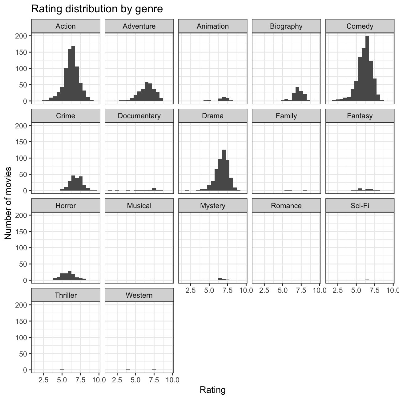
Scatterplot for gross and cast_facebook_likes
#Create scatterplot to examine the relationship between gross and cast_facebook_likes
plot5 <- movies %>%
  ggplot(aes(x=cast_facebook_likes, y=gross, alpha=.01)) + #Make the points opaque to see where there are denser areas
  geom_point() +
  geom_smooth() +
  scale_x_log10() + #log the x & y axes to see a clearer snapshot of what is occurring
  scale_y_log10() +
  theme_bw() +
  labs(title='Relationship Between Gross Profit and Facebook Likes', x='Facebook Likes', y='Gross Profit') +
  theme(legend.position = "none") +
  NULL

plot5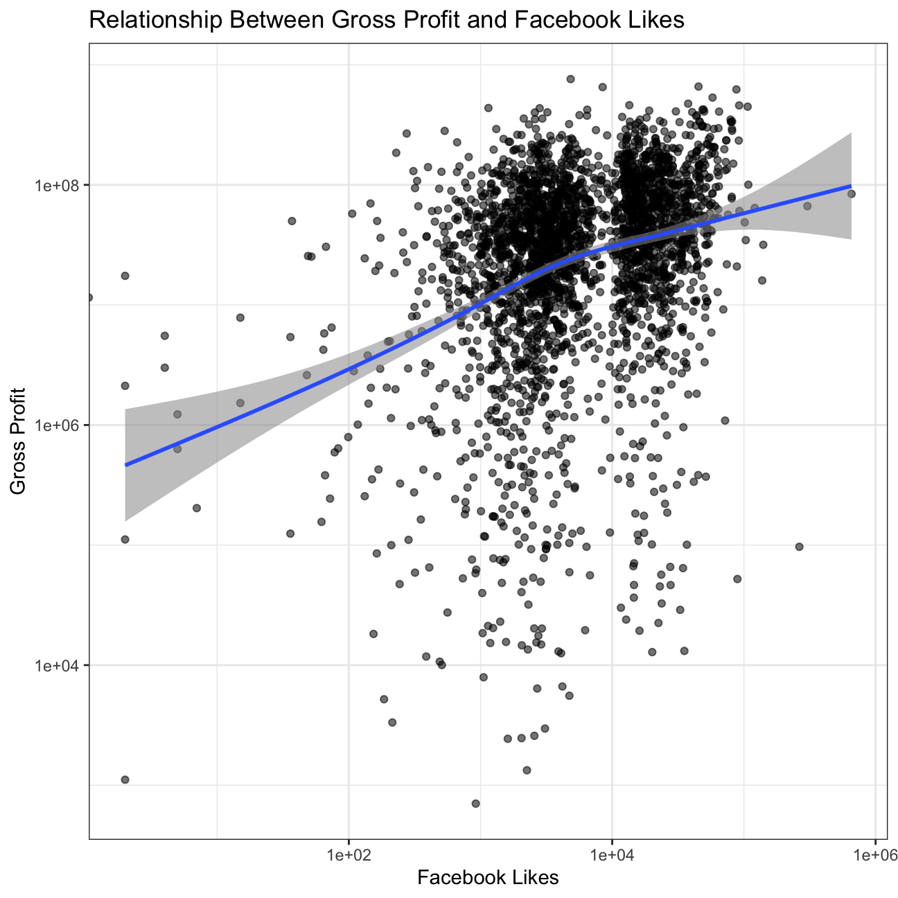
INFERENCE
The x-axis depicts the Facebook likes and the y-axis gross profits. While the data show a slight positive correlation between Facebook Likes and Gross Profit, there is immense variability, so Facebook likes do not seem to be a strong predictor of the money a movie makes. Mapping other variables could help determine what truly impacts the money a movie makes.
Scatterplot between gross and budget.
#Create scatterplot to examine the relationship between gross and budget
plot6 <- movies %>%
  ggplot(aes(x=budget, y=gross, alpha=.01)) + #Make the points opaque to see where there are denser areas
  geom_point() +
  geom_smooth() +
  theme_bw() +
  labs(title='Relationship Between Gross Profit and Budget', x='Budget', y='Gross Profit') +
  theme(legend.position = "none") +
  NULL

plot6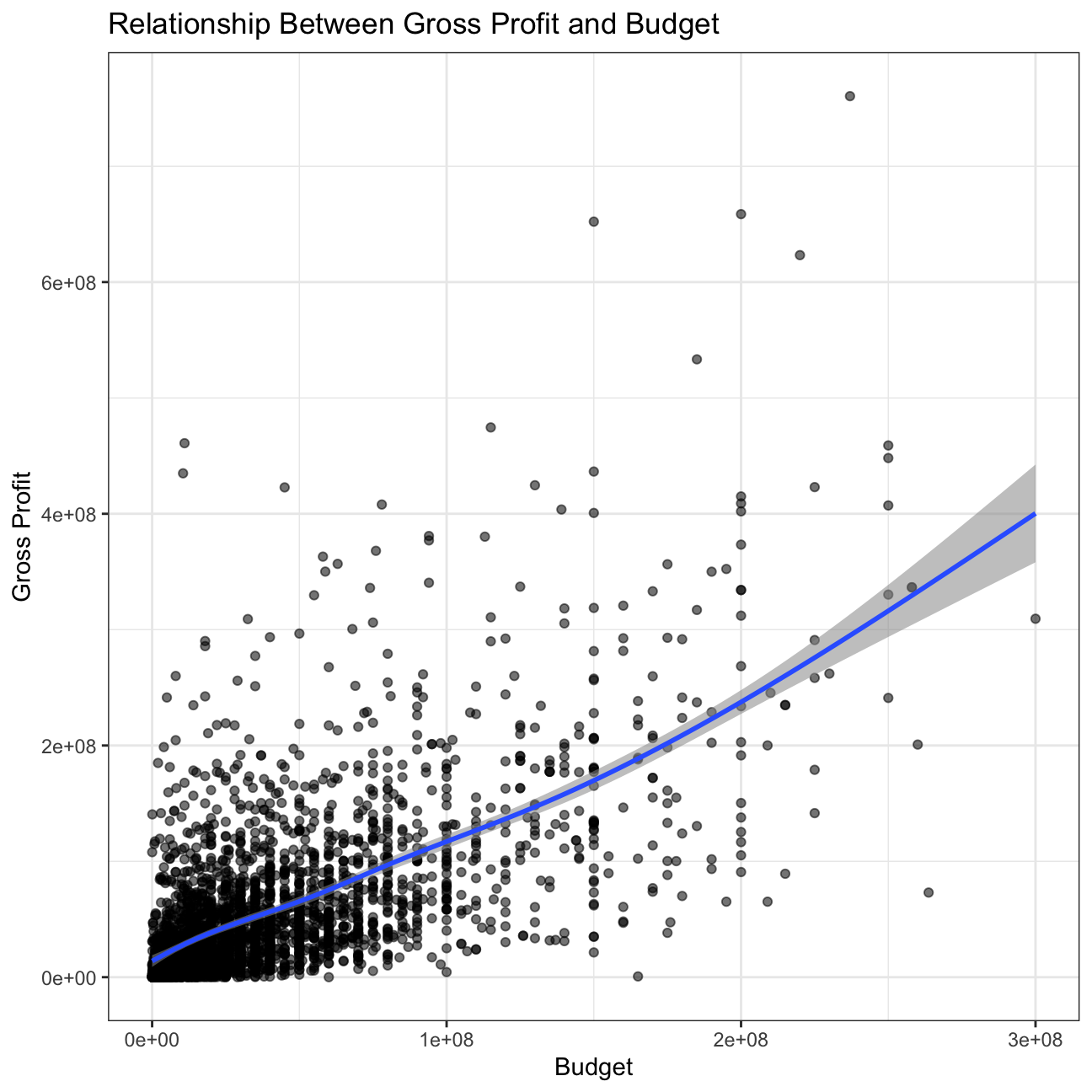
INFERENCE
Compared to the previous plot, this plot shows a higher correlation between budget and gross profit; however, there is still much variability and we cannot conclude that the relationship is significant.
Scatterplot between gross and rating.
#Create scatterplot to examine the relationship between gross and ratings, faceted by genre
plot7 <- movies %>%
ggplot(aes(x=rating, y=gross)) +
geom_point() +
facet_wrap(~genre) +
theme_bw() +
labs(title='Relationship Between Gross Profit and Rating', subtitle= 'By Genre', x='Rating', y='Gross Profit') +
NULL
plot7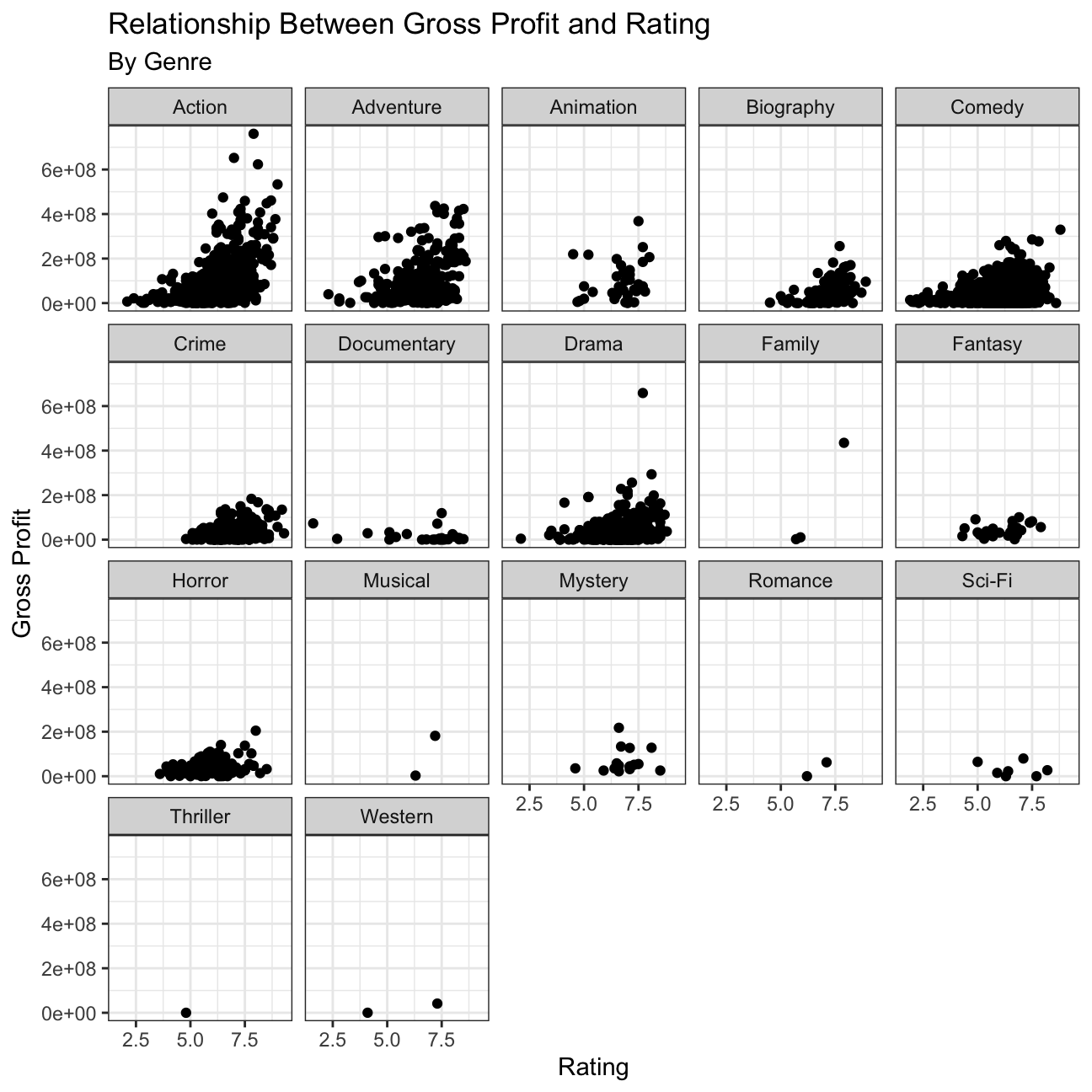 > INFERENCE
Our hypothesis before examining the data was that rating would be a good predictor of gross profit. While we see that is the case for Action, Adventure, and perhaps Drama, there are other genres that did not align with our hypothesis. Documentaries, for example, do not see a gross profit of greater than 200 mil but they do have high ratings. This makes sense because while Documentary films tend to have high ratings due to the realness of their topics, they are not popular films to see in the theaters.
There are irregularities in the dataset that these plots depict. Firstly, it seems that the dataset is highly imbalanced as there are very few data points for family, musical, romance, thriller, and western films. Next, it looks as though some genres have low gross profits compared to others, when historically those genres actually produce highly. For example, the Star Wars films are one of the highest grossing Sci-Fi films, and films in general, but the data do not reflect this. This may be due to the data only assigning one genre to a movie, so a movie like Star Wars would be assigned Action, rather than Sci-Fi.
Returns of financial stocks
We will use the tidyquant package to download historical data of stock
prices, calculate returns, and examine the distribution of returns.
We must first identify which stocks we want to download data for, and
for this we must know their ticker symbol; Apple is known as AAPL,
Microsoft as MSFT, McDonald’s as MCD, etc. The file nyse.csv contains
508 stocks listed on the NYSE, their ticker symbol, name, the IPO
(Initial Public Offering) year, and the sector and industry the company
is in.
nyse <- read_csv(here::here("data","nyse.csv"))
glimpse(nyse)
## Rows: 508
## Columns: 6
## $ symbol <chr> "MMM", "ABB", "ABT", "ABBV", "ACN", "AAP", "AFL", "A", "…
## $ name <chr> "3M Company", "ABB Ltd", "Abbott Laboratories", "AbbVie …
## $ ipo_year <chr> "n/a", "n/a", "n/a", "2012", "2001", "n/a", "n/a", "1999…
## $ sector <chr> "Health Care", "Consumer Durables", "Health Care", "Heal…
## $ industry <chr> "Medical/Dental Instruments", "Electrical Products", "Ma…
## $ summary_quote <chr> "https://www.nasdaq.com/symbol/mmm", "https://www.nasdaq…A table and a bar plot that shows the number of companies per sector, in descending order
#Create table for numbers of companies per sector in descending order
nyse %>%
  group_by(sector) %>%
  count(sort=T)
## # A tibble: 12 × 2
## # Groups: sector [12]
## sector n
## <chr> <int>
## 1 Finance 97
## 2 Consumer Services 79
## 3 Public Utilities 60
## 4 Capital Goods 45
## 5 Health Care 45
## 6 Energy 42
## 7 Technology 40
## 8 Basic Industries 39
## 9 Consumer Non-Durables 31
## 10 Miscellaneous 12
## 11 Transportation 10
## 12 Consumer Durables 8#Create bar plot for numbers of companies per sector in descending order
plot8 <- nyse %>%
group_by(sector) %>%
count(sort=T) %>%
ggplot(aes(x=n, y=fct_reorder(sector, n))) +
geom_col() +
theme_bw() +
labs(title='Number of Stocks By Sector', x='Number of Stocks', y='Sector') +
NULL
plot8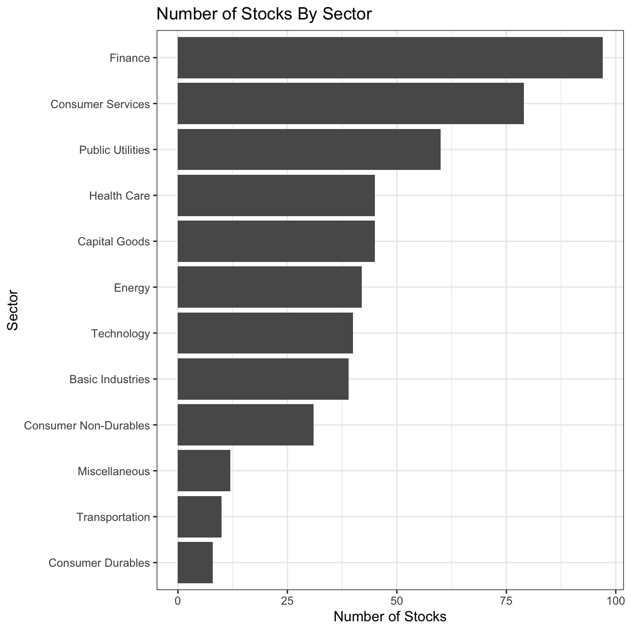
Next, let’s choose some stocks and their ticker symbols and download
some data. You MUST choose 6 different stocks from the ones listed
below; You should, however, add SPY which is the SP500 ETF (Exchange
Traded Fund).
myStocks <- c("AAPL","JPM","DIS","DPZ","ANF","SPY") %>%
  tq_get(get  = "stock.prices",
         from = "2011-01-01",
         to   = "2021-08-31") %>%
  group_by(symbol)

glimpse(myStocks)
## Rows: 16,098
## Columns: 8
## Groups: symbol [6]
## $ symbol <chr> "AAPL", "AAPL", "AAPL", "AAPL", "AAPL", "AAPL", "AAPL", "AAPL…
## $ date <date> 2011-01-03, 2011-01-04, 2011-01-05, 2011-01-06, 2011-01-07, …
## $ open <dbl> 11.6, 11.9, 11.8, 12.0, 11.9, 12.1, 12.3, 12.3, 12.3, 12.4, 1…
## $ high <dbl> 11.8, 11.9, 11.9, 12.0, 12.0, 12.3, 12.3, 12.3, 12.4, 12.4, 1…
## $ low <dbl> 11.6, 11.7, 11.8, 11.9, 11.9, 12.0, 12.1, 12.2, 12.3, 12.3, 1…
## $ close <dbl> 11.8, 11.8, 11.9, 11.9, 12.0, 12.2, 12.2, 12.3, 12.3, 12.4, 1…
## $ volume <dbl> 4.45e+08, 3.09e+08, 2.56e+08, 3.00e+08, 3.12e+08, 4.49e+08, 4…
## $ adjusted <dbl> 10.1, 10.2, 10.2, 10.2, 10.3, 10.5, 10.5, 10.6, 10.6, 10.7, 1…Financial performance analysis depend on returns; If I buy a stock today for 100 and I sell it tomorrow for 101.75, my one-day return, assuming no transaction costs, is 1.75%. So given the adjusted closing prices, our first step is to calculate daily and monthly returns.
#calculate daily returns
myStocks_returns_daily <- myStocks %>%
  tq_transmute(select     = adjusted,
               mutate_fun = periodReturn,
               period     = "daily",
               type       = "log",
               col_rename = "daily_returns",
               cols = c(nested.col))

#calculate monthly  returns
myStocks_returns_monthly <- myStocks %>%
  tq_transmute(select     = adjusted,
               mutate_fun = periodReturn,
               period     = "monthly",
               type       = "arithmetic",
               col_rename = "monthly_returns",
               cols = c(nested.col))

#calculate yearly returns
myStocks_returns_annual <- myStocks %>%
  group_by(symbol) %>%
  tq_transmute(select     = adjusted,
               mutate_fun = periodReturn,
               period     = "yearly",
               type       = "arithmetic",
               col_rename = "yearly_returns",
               cols = c(nested.col))
Table to summarise monthly returns for each of the stocks and SPY; min, max, median, mean, SD.
#Create a table that summarise min, max, median, mean, SD of monthly returns for each of the stock
myStocks_returns_monthly %>%
  group_by(symbol) %>%
  summarise(
    min=min(monthly_returns),
    max=max(monthly_returns),
    median=median(monthly_returns),
    mean=mean(monthly_returns),
    sd=sd(monthly_returns)) %>%
  mutate(across(2:6, round, 3)) #round for easier understanding
## # A tibble: 6 × 6
## symbol min max median mean sd
## <chr> <dbl> <dbl> <dbl> <dbl> <dbl>
## 1 AAPL -0.181 0.217 0.026 0.024 0.078
## 2 ANF -0.421 0.507 0.003 0.009 0.145
## 3 DIS -0.179 0.234 0.009 0.016 0.068
## 4 DPZ -0.188 0.342 0.025 0.031 0.075
## 5 JPM -0.229 0.202 0.022 0.015 0.072
## 6 SPY -0.125 0.127 0.017 0.012 0.038Plot a density plot, using geom_density(), for each of the stocks
#Create a density plot for each stocks
plot9 <- myStocks_returns_monthly %>%
  ggplot(aes(x=monthly_returns, colour=symbol, fill=symbol)) +
  geom_density(alpha=0.3) +
  facet_wrap(~symbol) +
  theme_bw() +
  theme(legend.position='none') +
  labs(title='Density Plot of Monthly Returns', x='Return', y='Density') +
  NULL

plot9 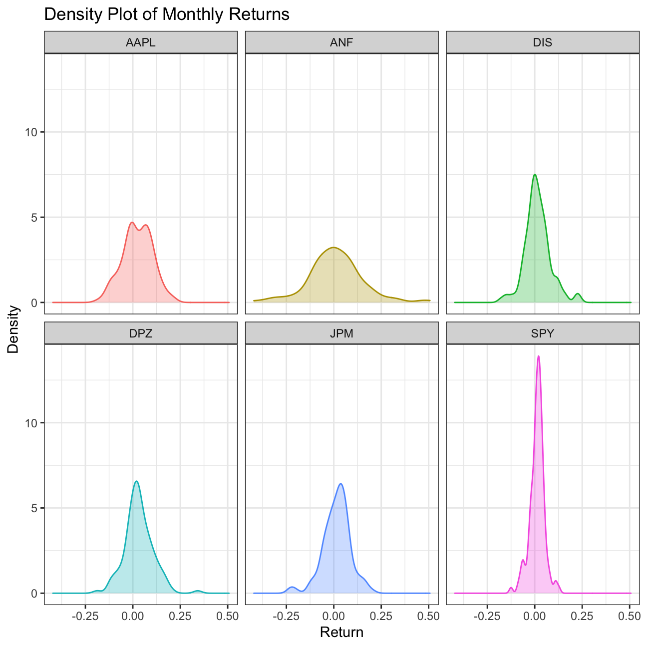
What can you infer from this plot? Which stock is the riskiest? The least risky?
Plotting the monthly returns for the stocks of various companies over time helps us determine the level of risk involved in such investments. According to the density plot, the most risky stock is ANF and the least risky is SPY.
Finally, make a plot that shows the expected monthly return (mean) of a
stock on the Y axis and the risk (standard deviation) in the X-axis.
Please use ggrepel::geom_text_repel() to label each stock
#Create a plot to identify the expected monthly return(mean) and rish(SD) of each stock
plot10 <- myStocks_returns_monthly %>%
group_by(symbol) %>%
summarise(
sd=sd(monthly_returns),
mean=mean(monthly_returns)) %>%
ggplot(aes(x=sd, y=mean, label=symbol)) + #Add the stock symbol as the label for each point
geom_point() +
theme_bw() +
ggrepel::geom_text_repel() + #Label each stock
labs(title='Risk and Return Plot for Selected Stocks', x='Risk', y='Return') +
NULL
plot10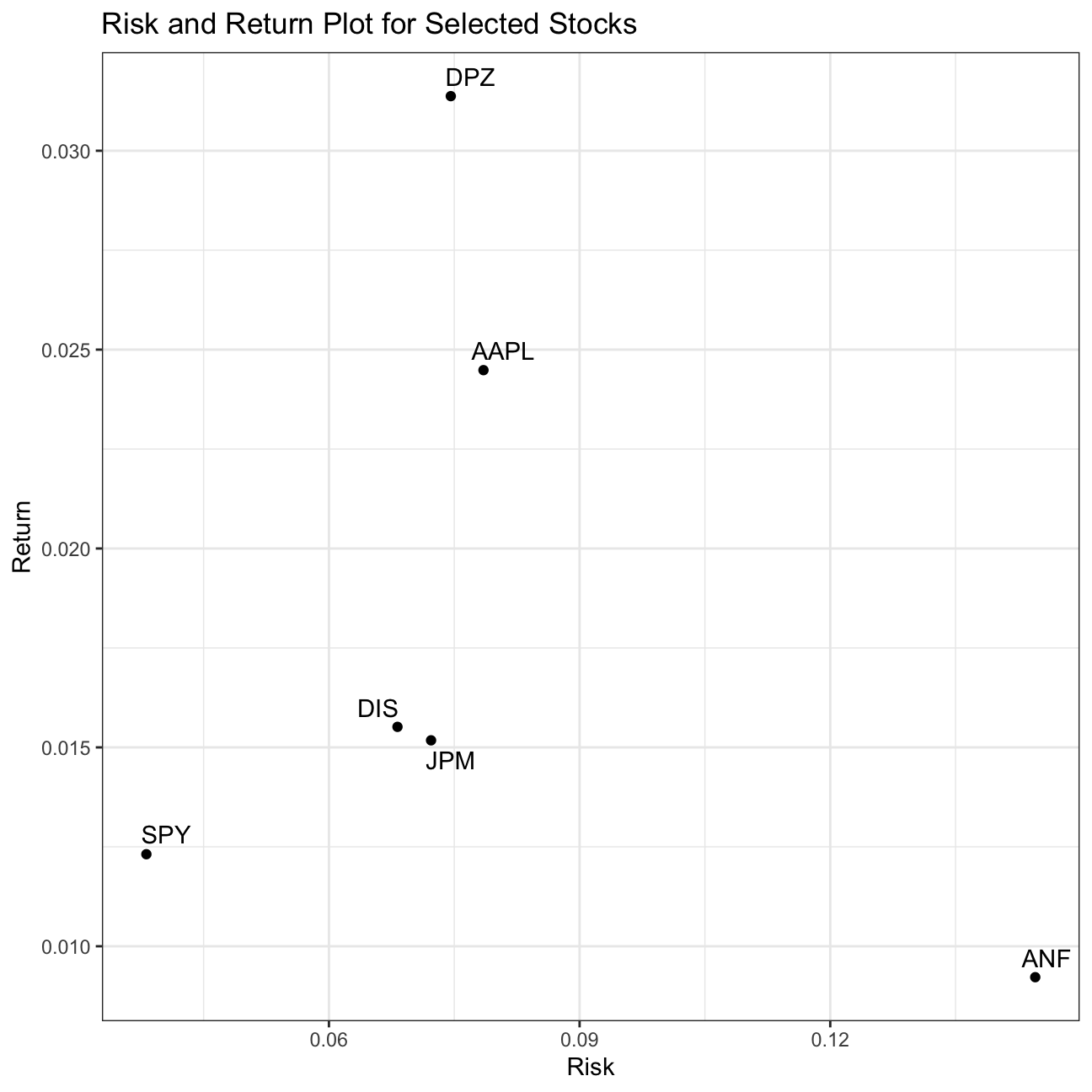 > What can you infer from this plot? Are there any stocks which, while
being riskier, do not have a higher expected return?
> What can you infer from this plot? Are there any stocks which, while
being riskier, do not have a higher expected return?
This plot depicts the risk-return relationship of each stock. While DPZ provides the highest return for a moderate risk level, ANF, despite being the riskiest, provides the least amount of return.
IBM HR Analytics
The IBM HR Analytics Employee Attrition & Performance data set is a fictional data set created by IBM data scientists. Among other things, the data set includes employees’ income, their distance from work, their position in the company, their level of education, etc. A full description can be found on the website.
Loading the data
#Load the data
hr_dataset <- read_csv(here::here("data", "datasets_1067_1925_WA_Fn-UseC_-HR-Employee-Attrition.csv"))
glimpse(hr_dataset)
## Rows: 1,470
## Columns: 35
## $ Age <dbl> 41, 49, 37, 33, 27, 32, 59, 30, 38, 36, 35, 2…
## $ Attrition <chr> "Yes", "No", "Yes", "No", "No", "No", "No", "…
## $ BusinessTravel <chr> "Travel_Rarely", "Travel_Frequently", "Travel…
## $ DailyRate <dbl> 1102, 279, 1373, 1392, 591, 1005, 1324, 1358,…
## $ Department <chr> "Sales", "Research & Development", "Research …
## $ DistanceFromHome <dbl> 1, 8, 2, 3, 2, 2, 3, 24, 23, 27, 16, 15, 26, …
## $ Education <dbl> 2, 1, 2, 4, 1, 2, 3, 1, 3, 3, 3, 2, 1, 2, 3, …
## $ EducationField <chr> "Life Sciences", "Life Sciences", "Other", "L…
## $ EmployeeCount <dbl> 1, 1, 1, 1, 1, 1, 1, 1, 1, 1, 1, 1, 1, 1, 1, …
## $ EmployeeNumber <dbl> 1, 2, 4, 5, 7, 8, 10, 11, 12, 13, 14, 15, 16,…
## $ EnvironmentSatisfaction <dbl> 2, 3, 4, 4, 1, 4, 3, 4, 4, 3, 1, 4, 1, 2, 3, …
## $ Gender <chr> "Female", "Male", "Male", "Female", "Male", "…
## $ HourlyRate <dbl> 94, 61, 92, 56, 40, 79, 81, 67, 44, 94, 84, 4…
## $ JobInvolvement <dbl> 3, 2, 2, 3, 3, 3, 4, 3, 2, 3, 4, 2, 3, 3, 2, …
## $ JobLevel <dbl> 2, 2, 1, 1, 1, 1, 1, 1, 3, 2, 1, 2, 1, 1, 1, …
## $ JobRole <chr> "Sales Executive", "Research Scientist", "Lab…
## $ JobSatisfaction <dbl> 4, 2, 3, 3, 2, 4, 1, 3, 3, 3, 2, 3, 3, 4, 3, …
## $ MaritalStatus <chr> "Single", "Married", "Single", "Married", "Ma…
## $ MonthlyIncome <dbl> 5993, 5130, 2090, 2909, 3468, 3068, 2670, 269…
## $ MonthlyRate <dbl> 19479, 24907, 2396, 23159, 16632, 11864, 9964…
## $ NumCompaniesWorked <dbl> 8, 1, 6, 1, 9, 0, 4, 1, 0, 6, 0, 0, 1, 0, 5, …
## $ Over18 <chr> "Y", "Y", "Y", "Y", "Y", "Y", "Y", "Y", "Y", …
## $ OverTime <chr> "Yes", "No", "Yes", "Yes", "No", "No", "Yes",…
## $ PercentSalaryHike <dbl> 11, 23, 15, 11, 12, 13, 20, 22, 21, 13, 13, 1…
## $ PerformanceRating <dbl> 3, 4, 3, 3, 3, 3, 4, 4, 4, 3, 3, 3, 3, 3, 3, …
## $ RelationshipSatisfaction <dbl> 1, 4, 2, 3, 4, 3, 1, 2, 2, 2, 3, 4, 4, 3, 2, …
## $ StandardHours <dbl> 80, 80, 80, 80, 80, 80, 80, 80, 80, 80, 80, 8…
## $ StockOptionLevel <dbl> 0, 1, 0, 0, 1, 0, 3, 1, 0, 2, 1, 0, 1, 1, 0, …
## $ TotalWorkingYears <dbl> 8, 10, 7, 8, 6, 8, 12, 1, 10, 17, 6, 10, 5, 3…
## $ TrainingTimesLastYear <dbl> 0, 3, 3, 3, 3, 2, 3, 2, 2, 3, 5, 3, 1, 2, 4, …
## $ WorkLifeBalance <dbl> 1, 3, 3, 3, 3, 2, 2, 3, 3, 2, 3, 3, 2, 3, 3, …
## $ YearsAtCompany <dbl> 6, 10, 0, 8, 2, 7, 1, 1, 9, 7, 5, 9, 5, 2, 4,…
## $ YearsInCurrentRole <dbl> 4, 7, 0, 7, 2, 7, 0, 0, 7, 7, 4, 5, 2, 2, 2, …
## $ YearsSinceLastPromotion <dbl> 0, 1, 0, 3, 2, 3, 0, 0, 1, 7, 0, 0, 4, 1, 0, …
## $ YearsWithCurrManager <dbl> 5, 7, 0, 0, 2, 6, 0, 0, 8, 7, 3, 8, 3, 2, 3, …Cleaning the dataset
#Clean the data set
hr_cleaned <- hr_dataset %>%
  clean_names() %>%
  mutate(
    education = case_when(
      education == 1 ~ "Below College",
      education == 2 ~ "College",
      education == 3 ~ "Bachelor",
      education == 4 ~ "Master",
      education == 5 ~ "Doctor"),
    environment_satisfaction = case_when(
      environment_satisfaction == 1 ~ "Low",
      environment_satisfaction == 2 ~ "Medium",
      environment_satisfaction == 3 ~ "High",
      environment_satisfaction == 4 ~ "Very High"),
    job_satisfaction = case_when(
      job_satisfaction == 1 ~ "Low",
      job_satisfaction == 2 ~ "Medium",
      job_satisfaction == 3 ~ "High",
      job_satisfaction == 4 ~ "Very High"),
    performance_rating = case_when(
      performance_rating == 1 ~ "Low",
      performance_rating == 2 ~ "Good",
      performance_rating == 3 ~ "Excellent",
      performance_rating == 4 ~ "Outstanding"),
    work_life_balance = case_when(
      work_life_balance == 1 ~ "Bad",
      work_life_balance == 2 ~ "Good",
      work_life_balance == 3 ~ "Better",
      work_life_balance == 4 ~ "Best")) %>%
  select(age, attrition, daily_rate, department,
         distance_from_home, education,
         gender, job_role,environment_satisfaction,
         job_satisfaction, marital_status,
         monthly_income, num_companies_worked, percent_salary_hike,
         performance_rating, total_working_years,
         work_life_balance, years_at_company,
         years_since_last_promotion)
hr_cleaned
## # A tibble: 1,470 × 19
## age attrition daily_rate department distance_from_ho… education gender
## <dbl> <chr> <dbl> <chr> <dbl> <chr> <chr>
## 1 41 Yes 1102 Sales 1 College Female
## 2 49 No 279 Research & De… 8 Below Col… Male
## 3 37 Yes 1373 Research & De… 2 College Male
## 4 33 No 1392 Research & De… 3 Master Female
## 5 27 No 591 Research & De… 2 Below Col… Male
## 6 32 No 1005 Research & De… 2 College Male
## 7 59 No 1324 Research & De… 3 Bachelor Female
## 8 30 No 1358 Research & De… 24 Below Col… Male
## 9 38 No 216 Research & De… 23 Bachelor Male
## 10 36 No 1299 Research & De… 27 Bachelor Male
## # … with 1,460 more rows, and 12 more variables: job_role <chr>,
## # environment_satisfaction <chr>, job_satisfaction <chr>,
## # marital_status <chr>, monthly_income <dbl>, num_companies_worked <dbl>,
## # percent_salary_hike <dbl>, performance_rating <chr>,
## # total_working_years <dbl>, work_life_balance <chr>, years_at_company <dbl>,
## # years_since_last_promotion <dbl>Observing attrition
hr_cleaned %>%
  summarize(
    count_yes=count(attrition == 'Yes'),
    count_total=count(attrition)) %>%
  mutate(proportion=count_yes/count_total, #Find the number of yes attrition/total attrition to find the proportion of people leaving the company
         across(proportion, round, 3)) %>% #round
  select(proportion)
## # A tibble: 1 × 1
## proportion
## <dbl>
## 1 0.192Distribution of age, years_at_company, monthly_income and years_since_last_promotion
hr_cleaned %>%
  select(age, years_at_company, monthly_income, years_since_last_promotion) %>%
  summary
## age years_at_company monthly_income years_since_last_promotion
## Min. :18.0 Min. : 0 Min. : 1009 Min. : 0.00
## 1st Qu.:30.0 1st Qu.: 3 1st Qu.: 2911 1st Qu.: 0.00
## Median :36.0 Median : 5 Median : 4919 Median : 1.00
## Mean :36.9 Mean : 7 Mean : 6503 Mean : 2.19
## 3rd Qu.:43.0 3rd Qu.: 9 3rd Qu.: 8379 3rd Qu.: 3.00
## Max. :60.0 Max. :40 Max. :19999 Max. :15.00Distribution of job_satisfaction and work_life_balance distributed
#Calculate the total number of employees
total <- nrow(hr_cleaned)

#Calculate the % of total of each job_satisfaction categories
hr_cleaned %>%
  group_by(job_satisfaction) %>%
  count() %>%
  mutate(proportion=n/total,
         across(proportion, round, 3)) %>% #round
  select(proportion)
## # A tibble: 4 × 2
## # Groups: job_satisfaction [4]
## job_satisfaction proportion
## <chr> <dbl>
## 1 High 0.301
## 2 Low 0.197
## 3 Medium 0.19
## 4 Very High 0.312#Calculate the % of total of each work_life_balance categories
hr_cleaned %>%
group_by(work_life_balance) %>%
count() %>%
mutate(proportion=n/total,
across(proportion, round, 3)) %>% #round
select(proportion)## # A tibble: 4 × 2
## # Groups: work_life_balance [4]
## work_life_balance proportion
## <chr> <dbl>
## 1 Bad 0.054
## 2 Best 0.104
## 3 Better 0.607
## 4 Good 0.234Boxplot between monthly income and education
#Create a box plot to examine the relationship between monthly income and education
plot11 <- hr_cleaned %>%
  ggplot(aes(x=monthly_income, y=reorder(education, monthly_income))) +
  geom_boxplot() +
  theme_bw() +
  labs(title='Relationship Between Education and Monthly Income', x='Monthly Income', y='Education') +
  NULL

plot11 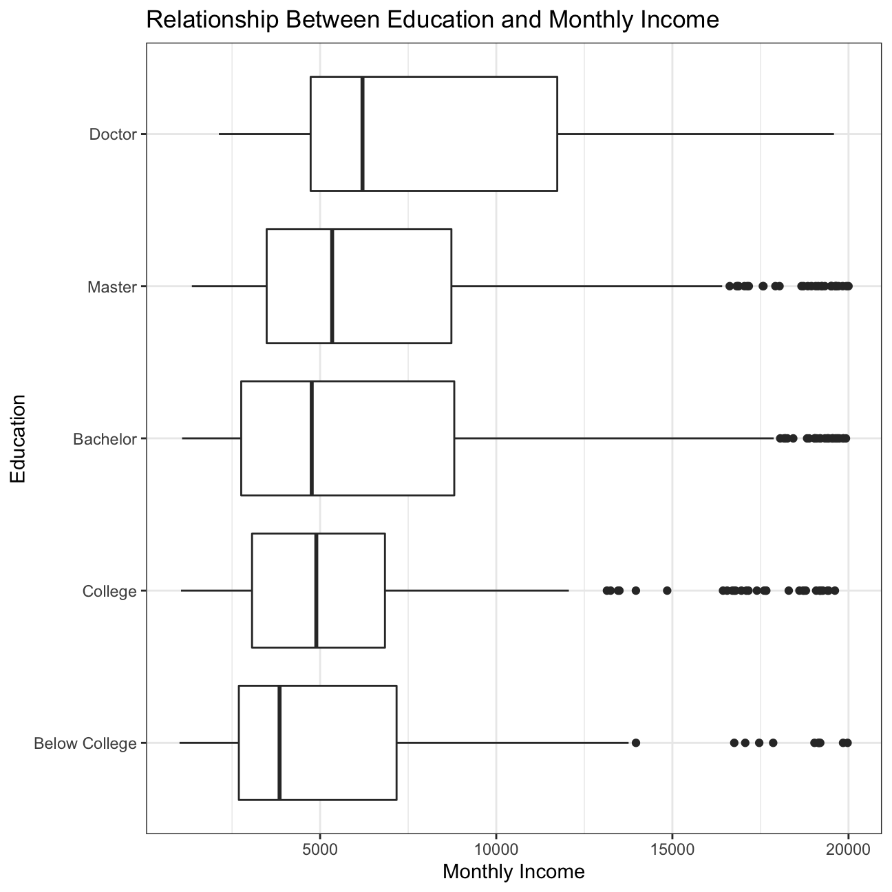
#Create a box plot to examine the relationship between monthly income and gender
plot12 <- hr_cleaned %>%
  ggplot(aes(x=monthly_income, y=reorder(gender, monthly_income))) +
  geom_boxplot() +
  theme_bw() +
  labs(title='Relationship Between Gender and Monthly Income', x='Monthly Income', y='Gender') +
  NULL

plot12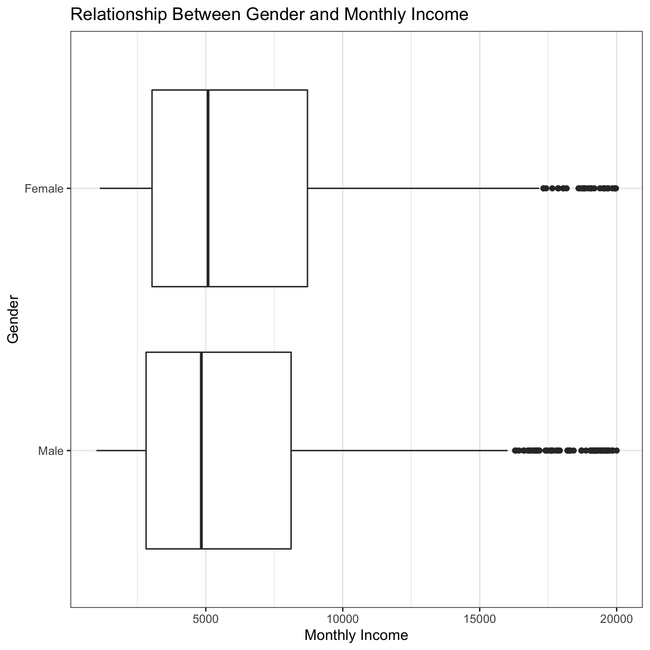
Boxplot of income vs job role.
#Create a box plot to examine the relationship between monthly income and job role
plot13 <- hr_cleaned %>%
  ggplot(aes(x=monthly_income, y=reorder(job_role, monthly_income))) + #Make the job roles appear in descending order of monthly income
  geom_boxplot() +
  theme_bw() +
  labs(title='Relationship Between Job Role and Monthly Income', x='Monthly Income', y='Job Role') +
  NULL

plot13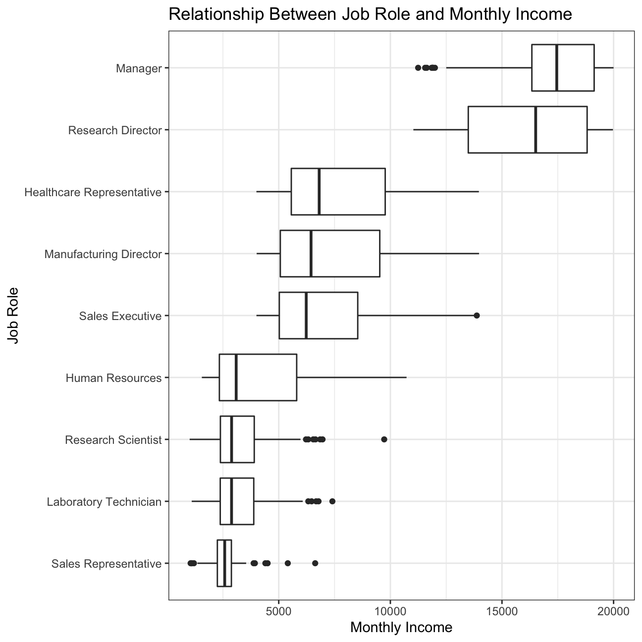
Bar chart of the mean (or median?) income by education level.
#Create a bar chart of mean income by education level
plot14 <- hr_cleaned %>%
  group_by(education) %>%
  summarise(mean=mean(monthly_income)) %>% #Calculate the mean income
  ggplot(aes(x=education, y=mean)) +
  geom_col() +
  theme_bw() +
  labs(title='Relationship Between Education and Average Monthly Income', x='Education', y='Average Monthly Income') +
  NULL

plot14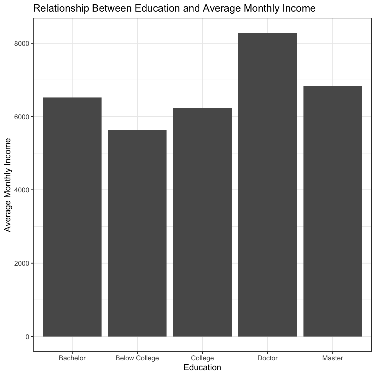
Density plot of monthly income by education level
#Create a density plot of monthly income by education level, faceted by education level
plot15 <- hr_cleaned %>%
  ggplot(aes(x=monthly_income, colour=education, fill=education)) +
  geom_density(alpha=0.3) +
  facet_wrap(~education) +
  theme_solid() +
  theme(legend.position='none', text=element_text(size=10)) +
  labs(title='Density Plot of Monthly Income', subtitle='By Education Level', x='Monthly Income', y='Density') +
  NULL

plot15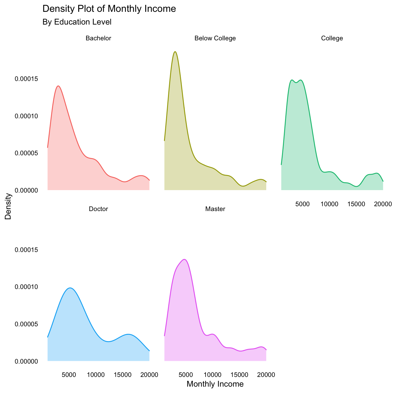
- Plot income vs age, faceted by
job_role.
#Create a scatter plot if income vs age, facted by job roles
plot16 <- hr_cleaned %>%
  ggplot(aes(y=monthly_income, x=age, color=job_role)) +
  facet_wrap(~job_role) +
  geom_point() +
  theme(legend.position='none') +
  labs(title='Relationship Between Age and Monthly Income', subtitle='By Job Role', x='Monthly Income', y='Age') +
  NULL

plot16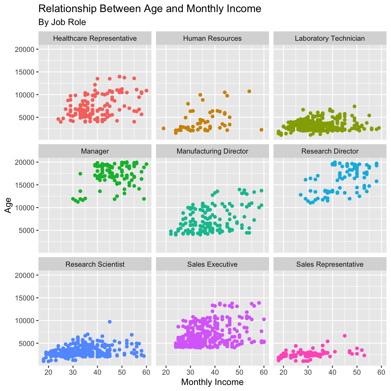
INFERENCE
After analysis of the IBM HR Analytics Employee Attrition & Performance Data, we discovered interesting information that may be useful for senior leaders and HR departments to utilize when making decisions to improve the company.
We looked at statistics regarding employee satisfaction, work-life balance, and attrition. Looking at the proportion of job satisfaction, ranked in terms of Very High, High, Medium, or Low, we found that the percentage of employees that ranked Very High and High job satisfaction is 61.3% which is a substantial value. However, the percentage of employees that ranked Low is quite high at 19.7%. The IBM HR department should investigate and work on ways to improve this value, at least to a Medium. It would also be worthwhile for the company to keep the data year by year and see if/how job satisfaction improves. Next, we looked at the proportion of work-life balance, a natural indicator of job satisfaction, which was ranked in terms of Best, Better, Good, and Bad. The percentage of employees that said bad is very low at 5.44%. However, we believe that since job satisfaction and work-life balance are so closely related, that both should be on the same scale of Very High, High, Medium, or Low. This would make it easier for the HR department to compare the data and it would give employees the opportunity to rank their work-life balance as Medium. Last in relation to employee satisfaction, we looked at employee turnover. We found that the turnover rate is 19.2% which is generally low; however, it is slightly higher compared to the average turnover rate for technology companies in the UK in 2019, which is 18.3% (Munss 2019).
We also looked at plots to compare the relationship between income and other variables, such as education, gender, job role, and age. The relationship between income and education is as expected, with the highest education (doctor) attaining higher income. Then, in descending order, master, bachelor, college, and below college, as expected. However, there are outliers in each of the education levels below doctor that reach high income levels at the same or even higher income than doctor. These outliers are great as they indicate that employees with lower education still have the opportunity to reach high income levels and should be used by the HR department when hiring people of different education levels. Another great observation was the relationship between income and gender which is very similar for males and females, with females achieving slightly higher income than males. This information should be shared when hiring and celebrated within the company. We also looked at the relationship between income and job role which was somewhat as expected. Managers and Research Directors have much higher income than the other roles, as their seniority and responsibilities is greater. Then Healthcare Representatives, Manufacturing Directors, Sales Executives come next with similar incomes, followed by Human Resources, Research Scientists, Laboratory Technicians, and Sales Representatives at the bottom of the income ladder. While the order of income by job role makes sense, there is high variability within each role, which does not make much sense. For employees with the same role, IBM should look at the data and try to lower the variability in income to create higher equality for their employees. Lastly, we looked at the relationship of income and age, grouped by job role. For most job roles, there is a small positive correlation between income and age; however, for Laboratory Technicians, Research Scientists, and Sales Representatives, there is very little. This tells us that income at IBM has more to do with the actual role than the age, which is understandable.
Lastly, we looked at summary statistics about age, income, years at company, and years since last promotion. Based on the summary statistics, we guessed that income and age would follow a distribution similar to a normal distribution because the mean and the median are closely aligned. When we actually looked at the density plots, only one of our hypothesis was correct: age. The other variables are highly skewed right, meaning the majority of IBM has lower income, years at company, and years since last promotion.
Challenge 1: Replicating a chart
The purpose of this exercise is to reproduce a plot using your dplyr
and ggplot2 skills. Read the article The Racial Factor: There’s 77
Counties Which Are Deep Blue But Also Low-Vaxx. Guess What They Have In
Common?
and have a look at the attached figure.

You dont have to worry about the blue-red backgound and don’t worry about replicating it exactly, try and see how far you can get. You’re encouraged to work together if you want to and exchange tips/tricks you figured out– and even though the figure in the original article is from early July 2021, you can use the most recent data.
Some hints to get you started:
- To get vaccination by county, we will use data from the CDC
- You need to get County Presidential Election Returns 2000-2020
- Finally, you also need an estimate of the population of each county
The below code creates a graph similar to that on the ACASignups website on Trump supporters and COVID vaccination rates:
#Cleaning the election result data
results_cleaned <- election2020_results %>%
  filter(candidate == 'DONALD J TRUMP', mode == 'TOTAL') %>% #Filtering for Donald Trump and Mode = Total since total is the default ballot mode in the US
  select(fips, candidatevotes, totalvotes) %>% #Selecting relevant columns
  mutate(percentage_trump=candidatevotes/totalvotes*100) %>% #Creating a new column for percentage of people who voted for Trump
  select(-candidatevotes, -totalvotes) #Getting rid of unnecessary columns

#Cleaning the vaccination data
vaccinations_cleaned <- vaccinations %>%
  filter(date == '07/04/2021') %>% #Filtering for July 4, 2021
  mutate(
    pct_vaccinated=case_when(
      recip_state %in% c('CA', 'GA', 'IA', 'MI', 'TX') ~ administered_dose1_pop_pct,
      T ~ series_complete_pop_pct)) %>% #Taking administered_dose1_pop_pct as the pct_vaccinated for CA, GA, IA, MI, and TX as says in the original plot
  select(fips, pct_vaccinated) %>% #Getting rid of unnecessary columns
  filter(pct_vaccinated > 0.0) #Filtering out pct_vaccinated = 0%

#Merging election result data and vaccination data
data <- results_cleaned %>%
  inner_join(population, by='fips') %>%
  inner_join(vaccinations_cleaned, by='fips') %>%
  filter()

#Graphing the data (Muster 2021).
data %>%
  ggplot(aes(x=percentage_trump, y=pct_vaccinated)) +
  geom_point(size=0.5) + #Adjusting point size to 0.5
  geom_point(aes(size=pop_estimate_2019), colour='blue', alpha=0.25) + #Adding circles with size based on population size in 2019 in opaque blue
  geom_hline(yintercept=85, linetype='dashed', color='black') + #Including Herd Immunity threshold at 85%
  annotate('text', x=23, y=87, label="Herd Immunity threshold (?)") +
  geom_hline(yintercept=53.9, linetype='dashed', color='black') + #Including Target threshold at 53.9%
  annotate('text', x=15.5, y=55.9, label="Target: 53.9%") +
  geom_hline(yintercept=50.8, linetype='dashed', color='black') + #Including Actual threshold at 50.8%
  annotate('text', x=15.5, y=52.8, label="Actual: 50.8%") +
  theme_bw() +
  theme(legend.position='none') +
  labs(title='COVID-19 VACCINATION LEVELS OUT OF TOTAL POPULATION BY COUNTY', subtitle='(most states based on FULLY vaccinated only; CA, GA, IA, MI & TX based on total doses administered)', x='2020 Trump Vote %', y='% of Total Population Vaccinated') + #Title and subtitle
  scale_size_continuous(range=c(1, 20)) + #Scaling the graph
  scale_x_continuous(breaks=seq(0, 100, 5)) +
  scale_y_continuous(breaks=seq(0, 100, 5)) +
  NULL
Challenge 2: Opinion polls for the 2021 German elections
The Guardian newspaper has an election poll tracker for the upcoming German election. The list of the opinion polls since Jan 2021 can be found at Wikipedia and the task is to reproduce the graph similar to the one produced by the Guardian.
The following code will scrape the wikipedia page and import the table in a dataframe.
url <- "https://en.wikipedia.org/wiki/Opinion_polling_for_the_2021_German_federal_election"
# https://www.economist.com/graphic-detail/who-will-succeed-angela-merkel
# https://www.theguardian.com/world/2021/jun/21/german-election-poll-tracker-who-will-be-the-next-chancellor

# get tables that exist on wikipedia page
tables <- url %>%
  read_html() %>%
  html_nodes(css="table")

# parse HTML tables into a dataframe called polls
# Use purr::map() to create a list of all tables in URL
polls <- map(tables, . %>%
             html_table(fill=TRUE)%>%
             janitor::clean_names())

# list of opinion polls
german_election_polls <- polls[[1]] %>% # the first table on the page contains the list of all opinions polls
  slice(2:(n()-1)) %>%  # drop the first row, as it contains again the variable names and last row that contains 2017 results
  mutate(
         # polls are shown to run from-to, e.g. 9-13 Aug 2021. We keep the last date, 13 Aug here, as the poll date
         # and we extract it by picking the last 11 characters from that field
         end_date = str_sub(fieldwork_date, -11),
         # end_date is still a string, so we convert it into a date object using lubridate::dmy()
         end_date = dmy(end_date),
         # we also get the month and week number from the date, if we want to do analysis by month- week, etc.
         month = month(end_date),
         week = isoweek(end_date))
The below text will produce a graph of the opinion poll similar to that by the Guardian:
#Select only necessary columns of the dataset
german_election_polls_cleaned <- german_election_polls %>%
  select(end_date, union, spd, af_d, fdp, linke, grune)

#Assigning colors to each political party, extracted from original plot using adobe color
col_union <- 'black'
col_spd <- '#BF0404'
col_af_d <- '#8C1F7A'
col_fdp <- '#F2AE2E'
col_linke <- '#0A5789'
col_grune <- '#45BF41'

#Plotting the election outcomes
plot <- german_election_polls_cleaned %>%
  ggplot +
  geom_point(aes(x=end_date, y=union, colour='black')) + #Union Party points assigned the color black
  geom_smooth(aes(x=end_date, y=union), colour='black', span=0.09, se=F) + #Union Party curve with span = 0.09 assigned the color black
  geom_point(aes(x=end_date, y=spd), colour=col_spd, alpha=0.5) + #SPD Party points assigned the color red
  geom_smooth(aes(x=end_date, y=spd), colour=col_spd, span=0.09, se=F) + #SPD Party curve with span = 0.09 assigned the color red
  geom_point(aes(x=end_date, y=af_d), colour=col_af_d, alpha=0.5) + #AfD Party points assigned the color purple
  geom_smooth(aes(x=end_date, y=af_d), colour=col_af_d, span=0.09, se=F) +  #AfD Party curve with span = 0.09 assigned the color purple
  geom_point(aes(x=end_date, y=fdp), colour=col_fdp, alpha=0.5) + #FDP Party points assigned the color yellow
  geom_smooth(aes(x=end_date, y=fdp), colour=col_fdp, span=0.09, se=F) + #FDP Party curve with span = 0.09 assigned the color yellow
  geom_point(aes(x=end_date, y=linke), colour=col_linke, alpha=0.5) + #Linke Party points assigned the color blue
  geom_smooth(aes(x=end_date, y=linke), colour=col_linke, span=0.09, se=F) + #Linke Party curve with span = 0.09 assigned the color blue
  geom_point(aes(x=end_date, y=grune), colour=col_grune, alpha=0.5) + #Grune Party points assigned the color green
  geom_smooth(aes(x=end_date, y=grune), colour=col_grune, span=0.09, se=F) + #Grune Party curve with span = 0.09 assigned the color green
  scale_y_continuous(breaks=seq(0, 40, 10), labels=c('0%', '10%', '20%', '30%', '40%')) + #Adjusting the scale
  geom_hline(yintercept=5, linetype='dashed', color='gray') +
  scale_color_manual(name='',
                     labels = c('Union', 'SPD', 'AfD', 'FDP', 'Linke', 'Grüne'),
                     values = c('col_union'=col_union,'col_spd'=col_spd,'col_af_d'=col_af_d,'col_fdp'=col_fdp,'col_linke'=col_linke,'col_grune'=col_grune)) + #Creating a legend
    labs(x='', y='') +
  theme_minimal() + #change theme to be more similar to the original
  theme(legend.background = element_rect(fill=NA, size=.3, linetype="solid")) + #add box around legend to be more similar to the original
  NULL

ggsave(file='elections_plot.png', plot=plot, width=18, height=8)

plot
Details
Who did you collaborate with: Hanlu Lin, Hao Ni, Junna Yanai, Lazar Jelic, Purva Sikri, Valeria Morales
Approximately how much time did you spend on this problem set: 7 hours
What, if anything, gave you the most trouble: Finding the filtering criteria of the election results in the first challenge, Showing a chart legend in the second challenge
Bibliography
Kohli, S. There are places on earth where and beer are cheaper than water. Retrieved September 4, 2021, https://qz.com/319919/these-are-the-places-on-earth-where-wine-and-beer-are-cheaper-than-water
Munns, S (2019). Employee Turnover Rates by Industry Comparison. Retrieved September 3, 2021, https://www.e-days.com/news/employee-turnover-rates-an-industry-comparison
Muster, Hans (2021) Recoil Source code
Nugent, P. What Namibia’s breweries tell us about the nation’s past. Retrieved September 4, 2021, https://qz.com/africa/1982787/how-namibian-beer-politics-and-identity-all-align
OECD/The World Bank (2020), Health at a Glance: Latin America and the Caribbean 2020, OECD Publishing, Paris, https://doi.org/10.1787/6089164f-en